2026 Colors of the Year
3 COLORS FROM THE LEADING BRANDS INFLUENCING INTERIOR DESIGN
2026 Might be the year of less-than-riveting “Color of the Year” declarations. Maybe it is what we need.


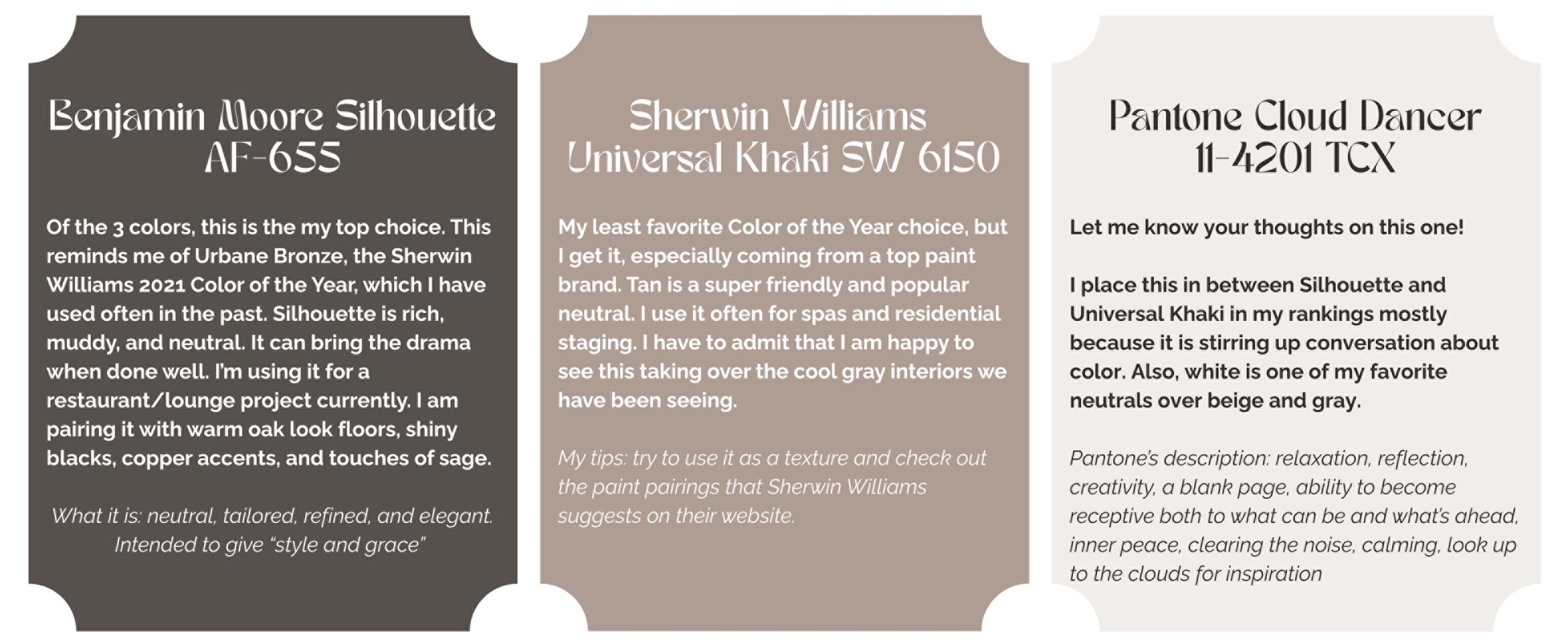
Benjamin Moore announced Silhouette AF-655, a deep gray-brown, as its color of the year - a color similar to Urbane Bronze, the Sherwin Williams 2021 Color of the Year. It’s safe. It is rich. It is muddy. It is neutral. It’s not new. But, it can bring the drama when done well. Benjamin Moore refers to it as neutral, tailored, refined, and elegant. Intended to give “style and grace” to the space. I’m using it for a restaurant/lounge project now. The client’s eye went straight to it in a pile of swatches. Plenty more about Silhouette in future posts.
Even safer is Sherwin Williams Universal Khaki SW6150. Call it tan. Call it beige. Call it landlord's favorite. I flashback to people saying “it hides dirt” when they are making carpet or paint choices. (To which I counter that pattern hides dirt and stains better - as proven by many high traffic hotel floors worldwide.) But Universal Khaki has its strengths. It is a warmer neutral than those cold grays we have been seeing too much. It can look great with a little thoughtful texture and placement. (NOT as a beige microfiber sofa!) It plays well with others. It is that friend whose presence instantly puts you at ease. Sherwin Williams calls it neutral, easygoing, timeless, and gives a presence of contemporary comfort and strength in simplicity.
Pantone recently announced Cloud Dancer 11-4201, and the internet is blowing up. Pantone is making the news like never before. Why? Because the color is seen as ordinary white. And while Pantone is saying their oh-so-slightly off white choice is meant to evoke calm; it is doing the opposite and is disruptive and controversial. Arguably a good marketing tactic because people are talking about the “Pantone Color of the Year” more than ever or, better yet, for the first time in their lives. Jokes are being made. Cloud Dancer’s presence has become hilarious, memorable, and viral. Pantone refers to their selection using the words “relaxation, reflection, creativity, a blank page, ability to become receptive both to what can be and what’s ahead, inner peace, clearing the noise, calming, look up to the clouds for inspiration” and other effusive terms that may seem like a stretch or could ring true considering how much visual noise we are bombarded with daily. They have a really great collaboration with Joybird to bring the cloud-like interiors to life. I do love a white couch. Still, white is inevitable. It is here to stay with or without Pantone’s marketing. Does it even need to be a COTY? Or could this title have been given to a more outstanding color?
These 3 colors of the year are not only predictions of what to come, but also reactions of what has been going on around us. The easiest one for me to point out is that cool gray’s time is up, so we are moving back to tans such as Universal Khaki. Swapping from gray to tan is a cycle we can see historically in mainstream production. In interiors, we get oversaturated by whatever THE neutral paint is, and then grow tired of it. Our flooring, cabinets and furniture have been doused in gray for the past decade.The gray/tan/gray/tan pattern happens with fashion too. Going back to tan is totally expected, but not exciting as far as a color of the year choice goes.
All 3 companies state that their choices were selected intentionally to fall into the safe and neutral side of the spectrum. You aren’t supposed to be excited. We’ve had enough excitement starting in 2021 - after which the scary pandemic begged for a dose of optimistic color to cheer us up - but gradually. 2022 was like cautiously emerging from our homes, looking up to the blue sky, and being captivated by the green grass and flowers. 2023 hit us with punchy reds and pinks because we were feeling brave. 2024 took it down a notch but kept it fresh and optimistic with peaches and blues. 2025’s colors started heading back towards the richer neutrals. Which brought us to our 2026 offerings. Today there is a lot of bleak talk about the future. We are burned out from the divisiveness in the media and the noise pushing us to take sides on topics rather than reaching an agreement in a nice neutral space. Enter the diplomatic friends who surround us with comfort and warmth - muted brown, neutral tan, and simple white. There is a reason these colors come up as the base to my spa work again and again. They naturally calm the senses. And maybe that is what we need to recover from all the intensity of the first half of this decade.
BONUS - My rankings on the 2026 COTY selections